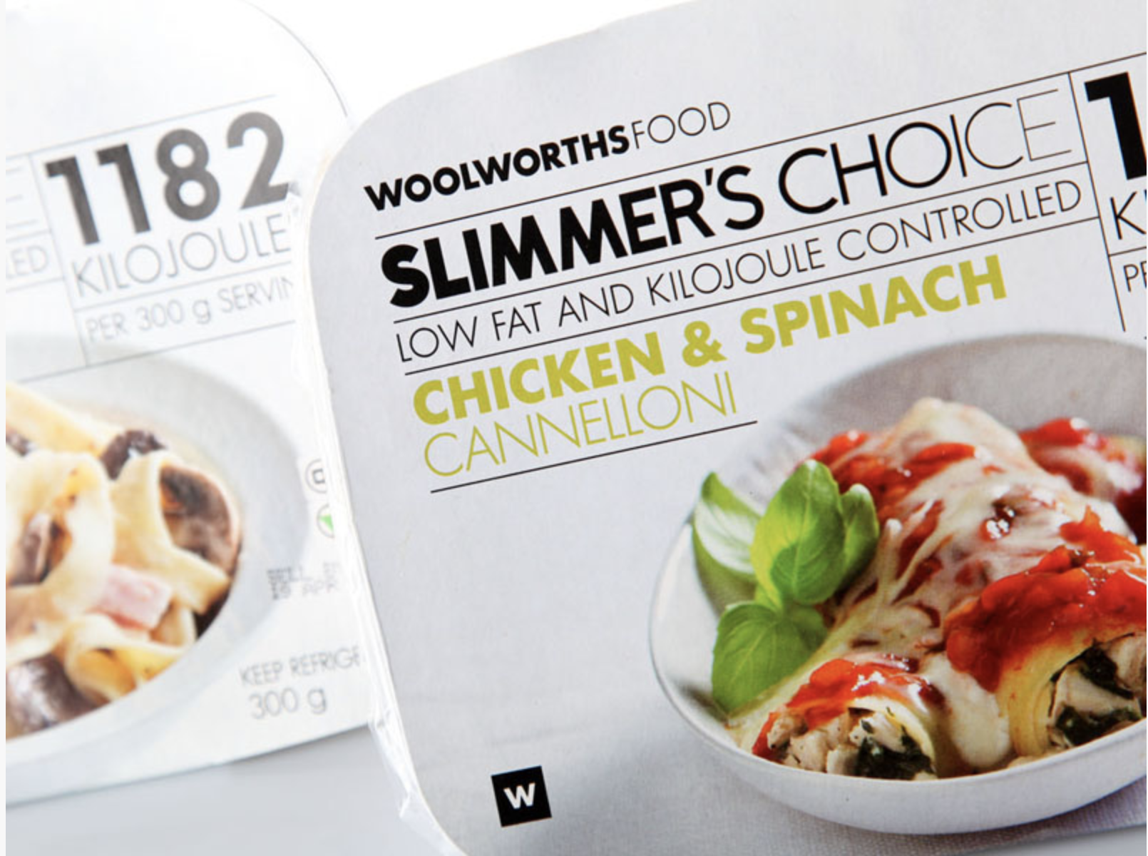
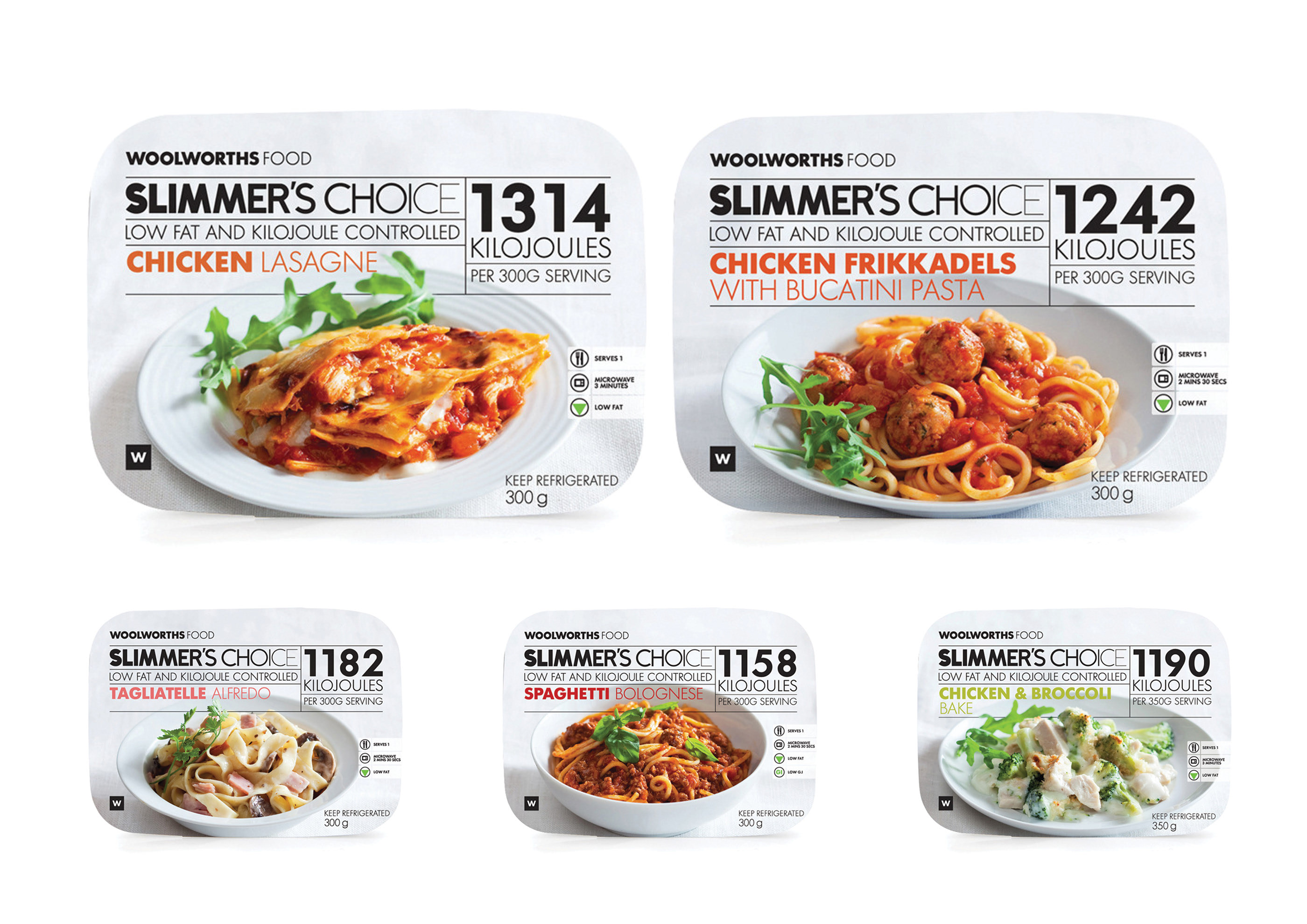
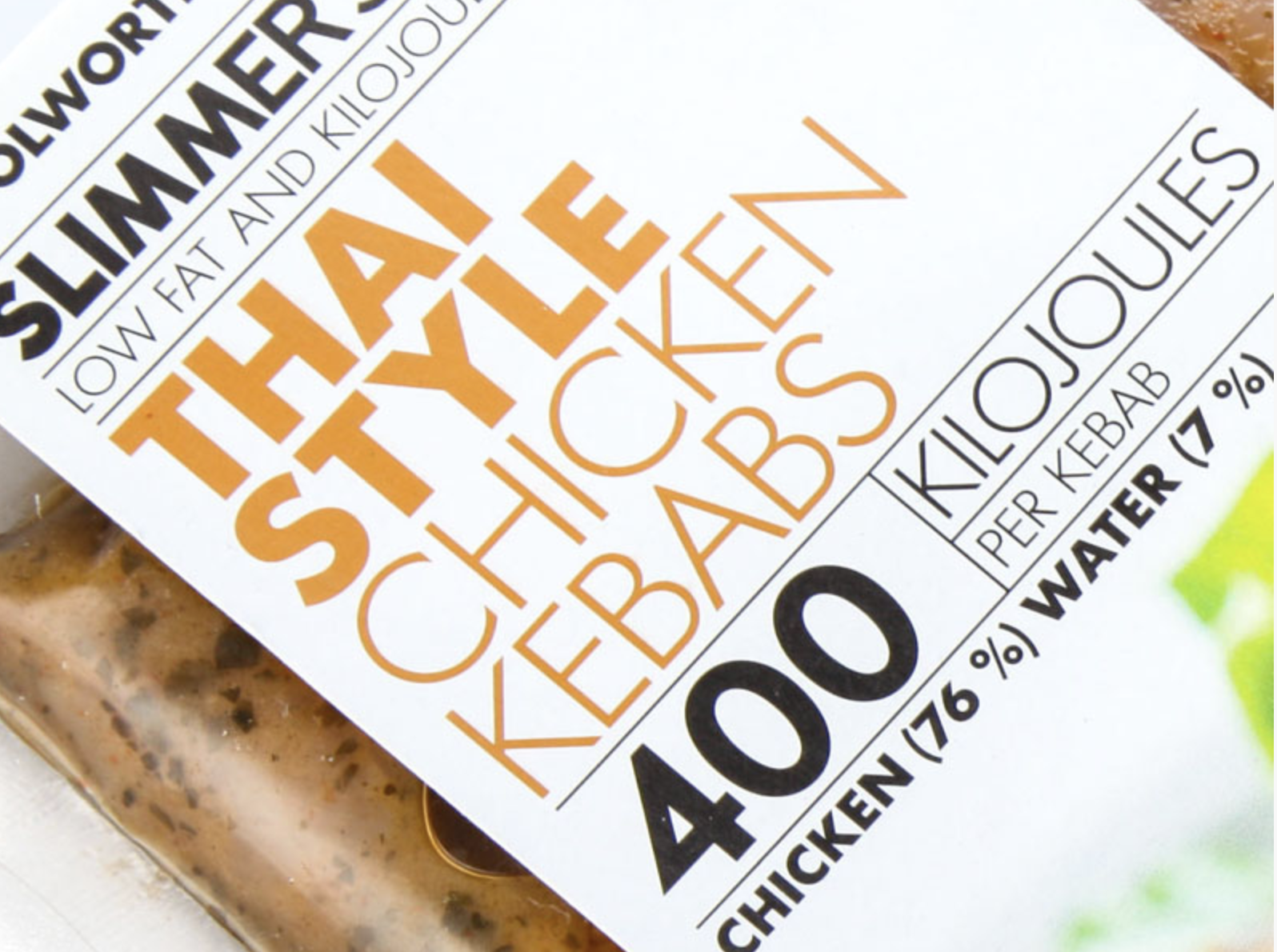
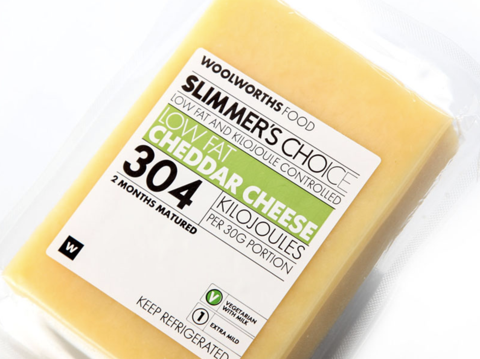
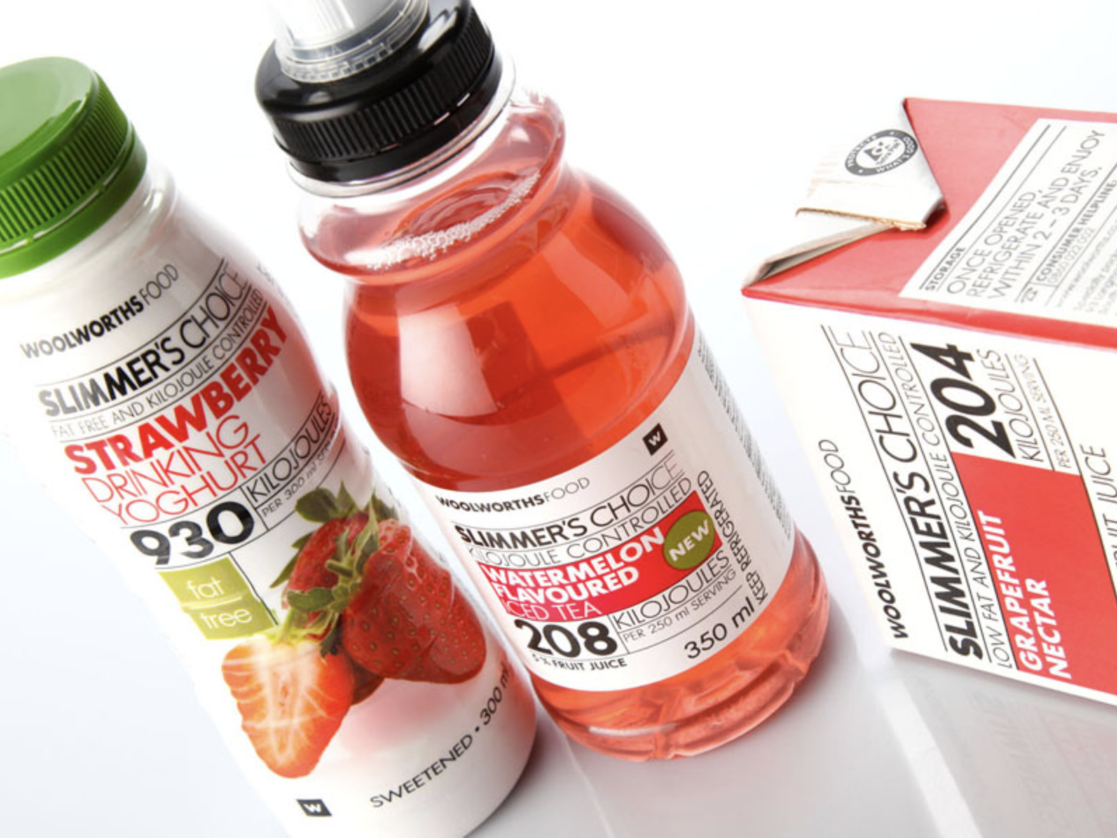
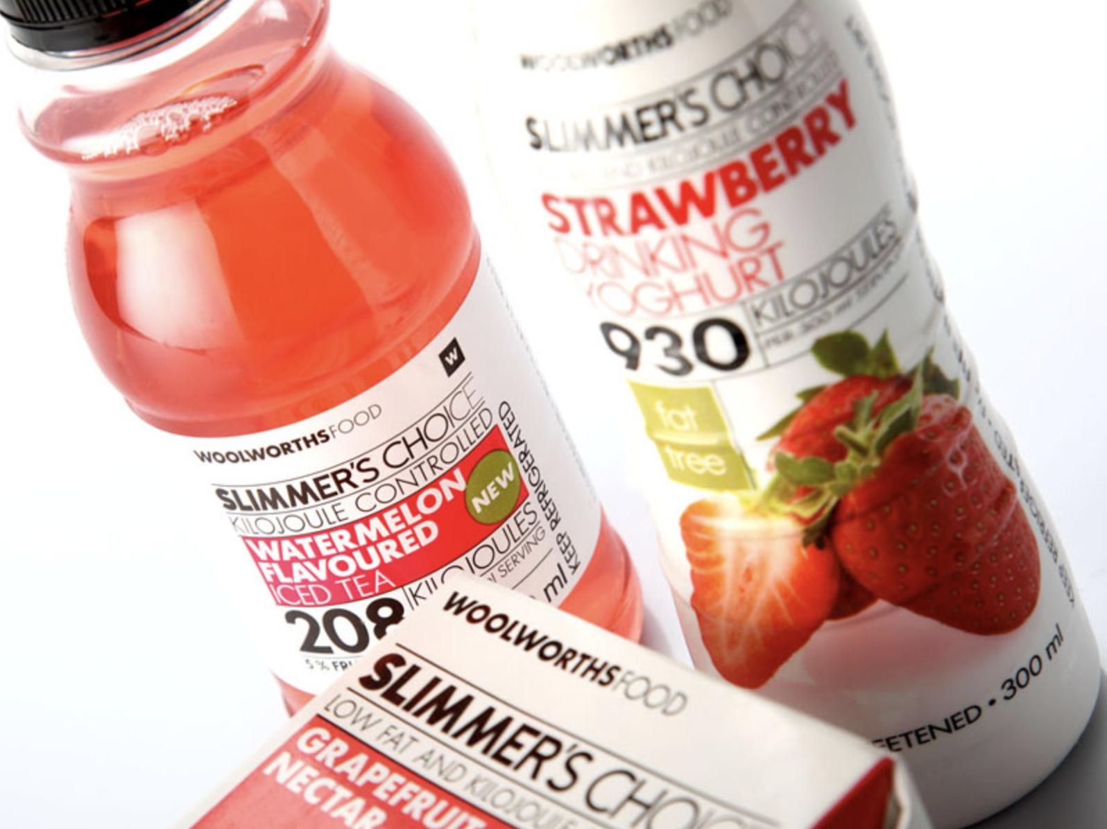
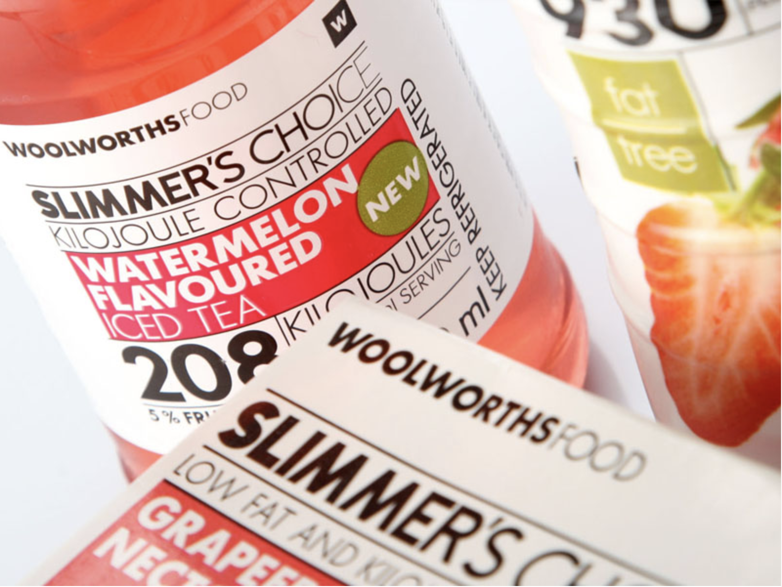
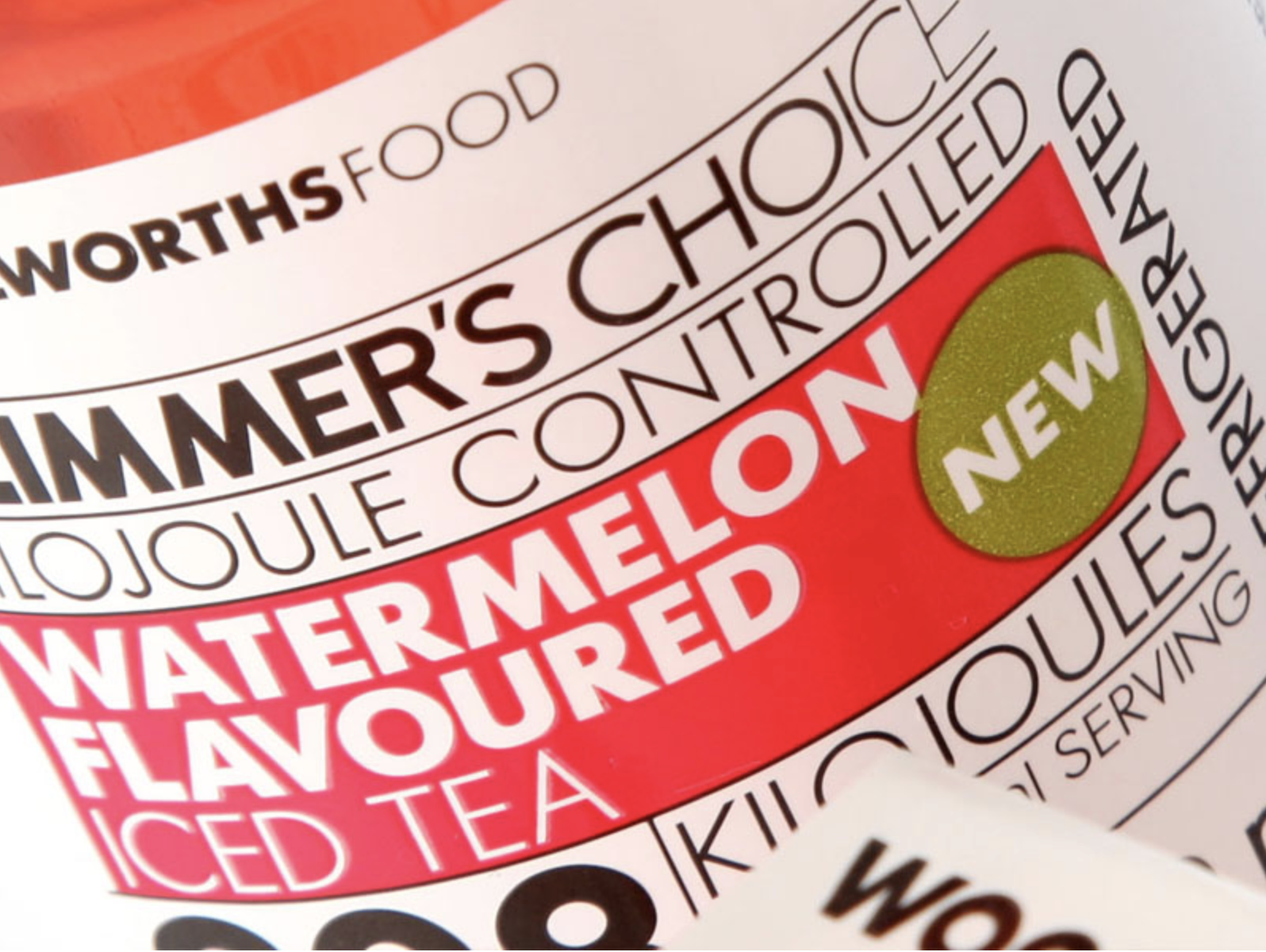
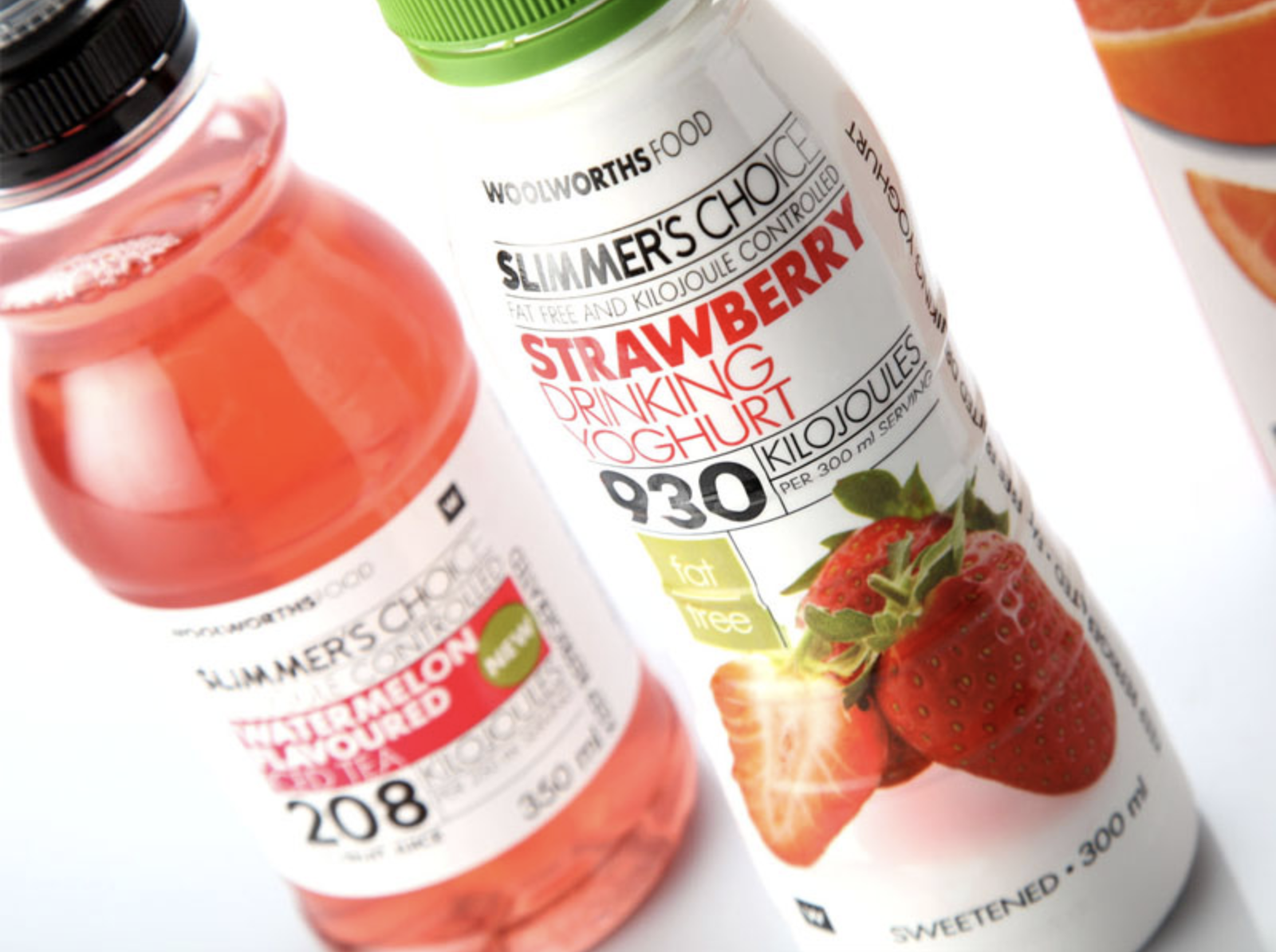
Woolworths SA Slimmer’s Choice Packaging Range Design
–
Developed in collaboration with the now Executive Creative Director of Woolworths, this project involved creating a clear and compelling brand identity for the Slimmer’s Choice food range. The goal was to design packaging that speaks directly to health-conscious customers by making nutritional information easy to access and understand at a glance. The visual system was built to strike a balance between freshness, simplicity, and clarity — supporting mindful food choices without compromising on shelf appeal.
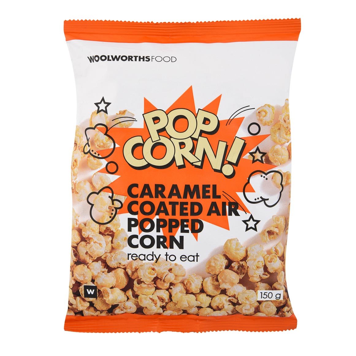
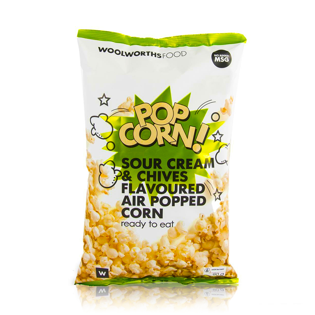
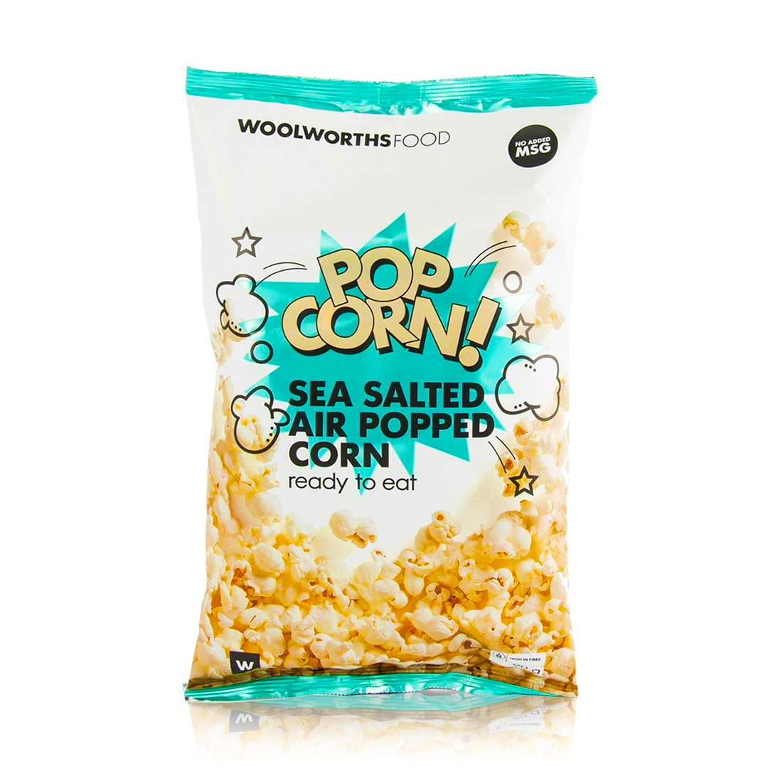
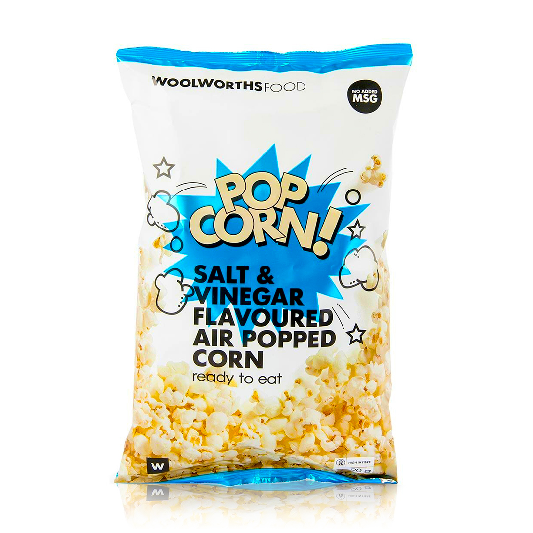
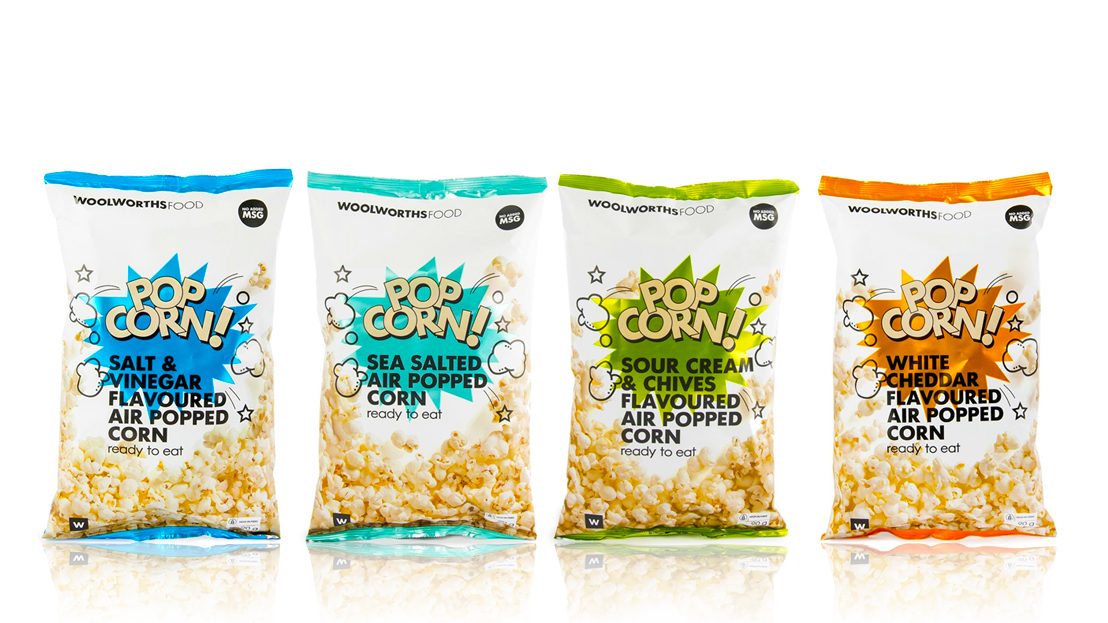
Woolworths SA Popcorn Range
–
Redesigned popcorn packaging led to a remarkable 25% increase in sales. Art direction for product photography resulted in impactful visuals that contributed to the project’s success.

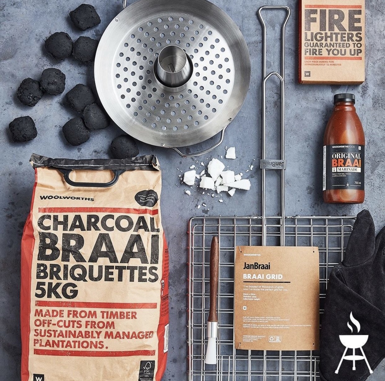
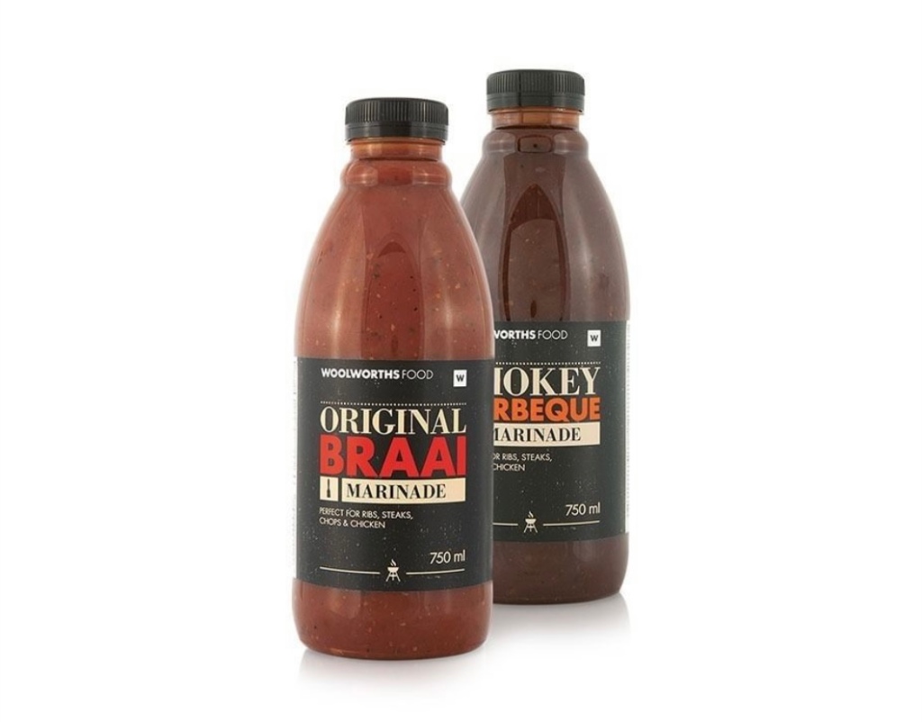
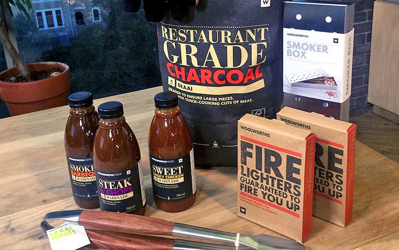
Woolworths SA Packaging Design
–
Originally redesigned in 2012, the Woolworths Braai range was built on bold typography, sustainable packaging cues, and a distinctly South African feel. Over a decade later, the range has been refreshed to maintain its strong shelf presence while evolving with current design trends. The project involved updating the overall look and feel, refining packaging lockups across the full product range, and setting the art direction for cohesive, lifestyle-driven product photography. The refreshed identity was then rolled out across online platforms, social media, in-store visual merchandising, and promotional materials to ensure brand continuity while subtly modernising the range for today’s consumer.


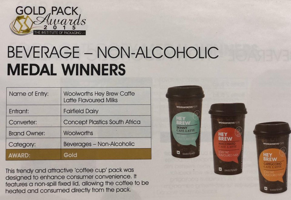
HEY BREW Coffee Cup Design
–
This trendy and functional coffee cup packaging was created to elevate consumer convenience and on-the-go appeal. Featuring a fixed, non-spill lid, the design allowed customers to heat and enjoy their coffee directly from the pack—blending style with practicality. As a collaborative project, our team led the development of the playful, coffee-themed illustrations that wrap around the cup, adding warmth and character to the product experience. The bold colour blocking and speech bubble device helped differentiate variants and ensured standout shelf visibility. Recognised for its innovative design, Hey Brew was awarded the 2015 Gold Pack Award, affirming its impact in the FMCG space.

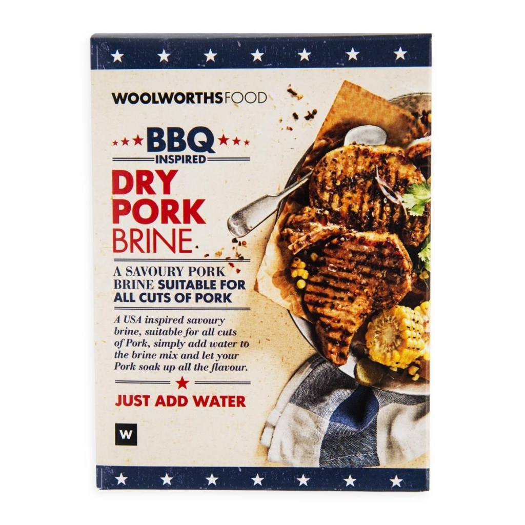
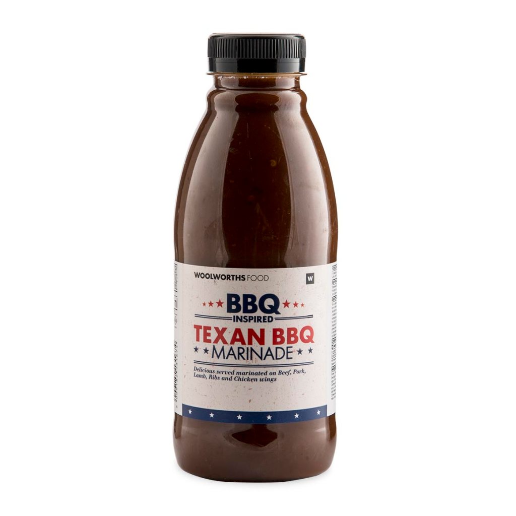
BBQ-Inspired Braai Range Design
–
Developed for Woolworths Food, this packaging design formed part of their BBQ-inspired seasoning range, crafted to appeal to home cooks seeking flavour and ease. The visual language draws from traditional American barbecue culture—using bold typography, star detailing, and a rustic palette to evoke authenticity and heat. A key element of the project was the art direction of the food photography, which focused on capturing rich textures, chargrilled surfaces, and warm tones to create a mouthwatering, hearty feel. The imagery was styled to complement the pack design, reinforcing the promise of flavour and making the product instantly crave-worthy. Clear, punchy messaging like “Just Add Water” ensures the pack communicates quickly on shelf, combining aesthetic appeal with everyday convenience.

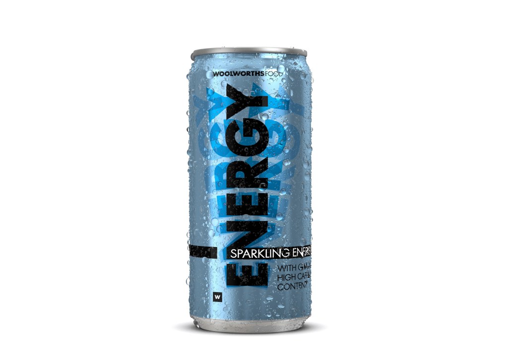
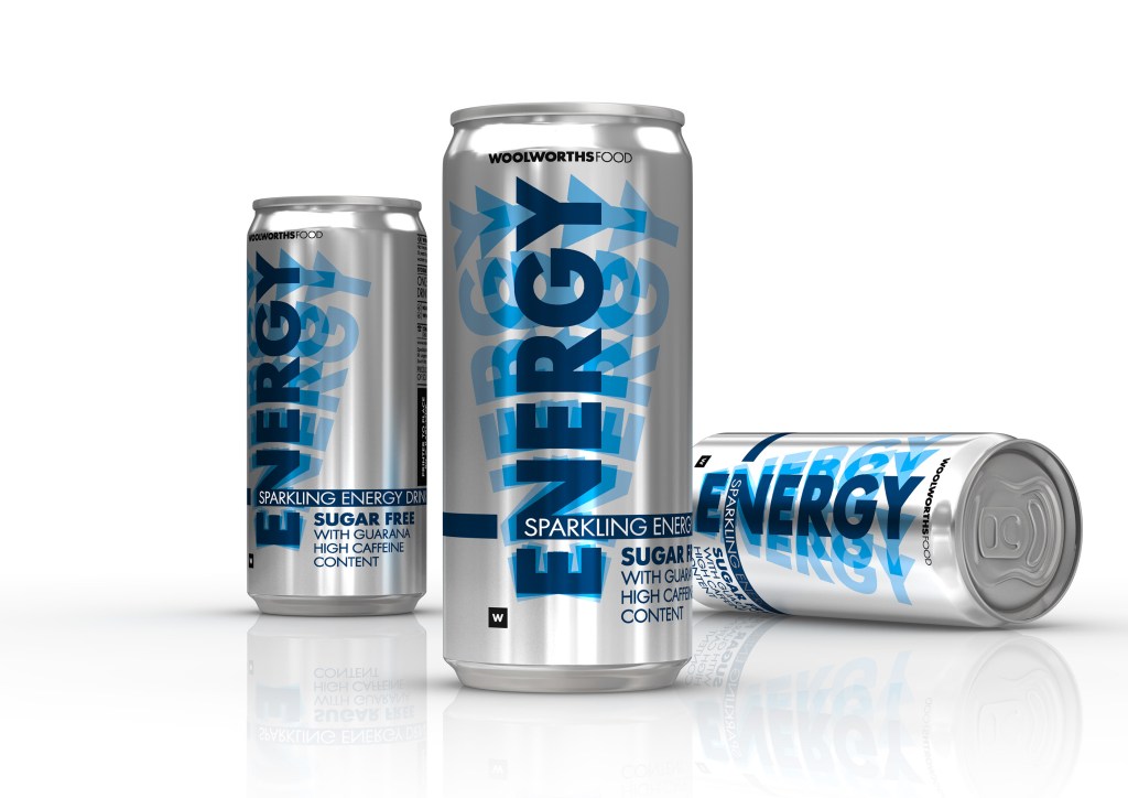
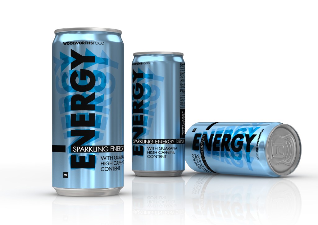
Sparkling Energy Drink Packaging Design
–
This project involved designing a bold, modern identity for Woolworths Food’s range of Sparkling Energy Drinks—crafted to appeal to health-conscious consumers seeking a cleaner energy boost. A key feature of the formulation was the exclusion of taurine, often associated with negative side effects such as increased heart rate. Instead, the drink leverages guarana and high caffeine content for a smoother, more natural uplift. The design approach focused on impactful shelf presence through oversized typography, a vibrant blue palette, and metallic finishes that reflect energy and movement. A sugar-free variant was also introduced, using a silver base to visually differentiate the range while maintaining consistency across both SKUs. The final packaging successfully communicates energy and clarity without the clutter, aligning with the product’s clean formulation and modern lifestyle appeal.
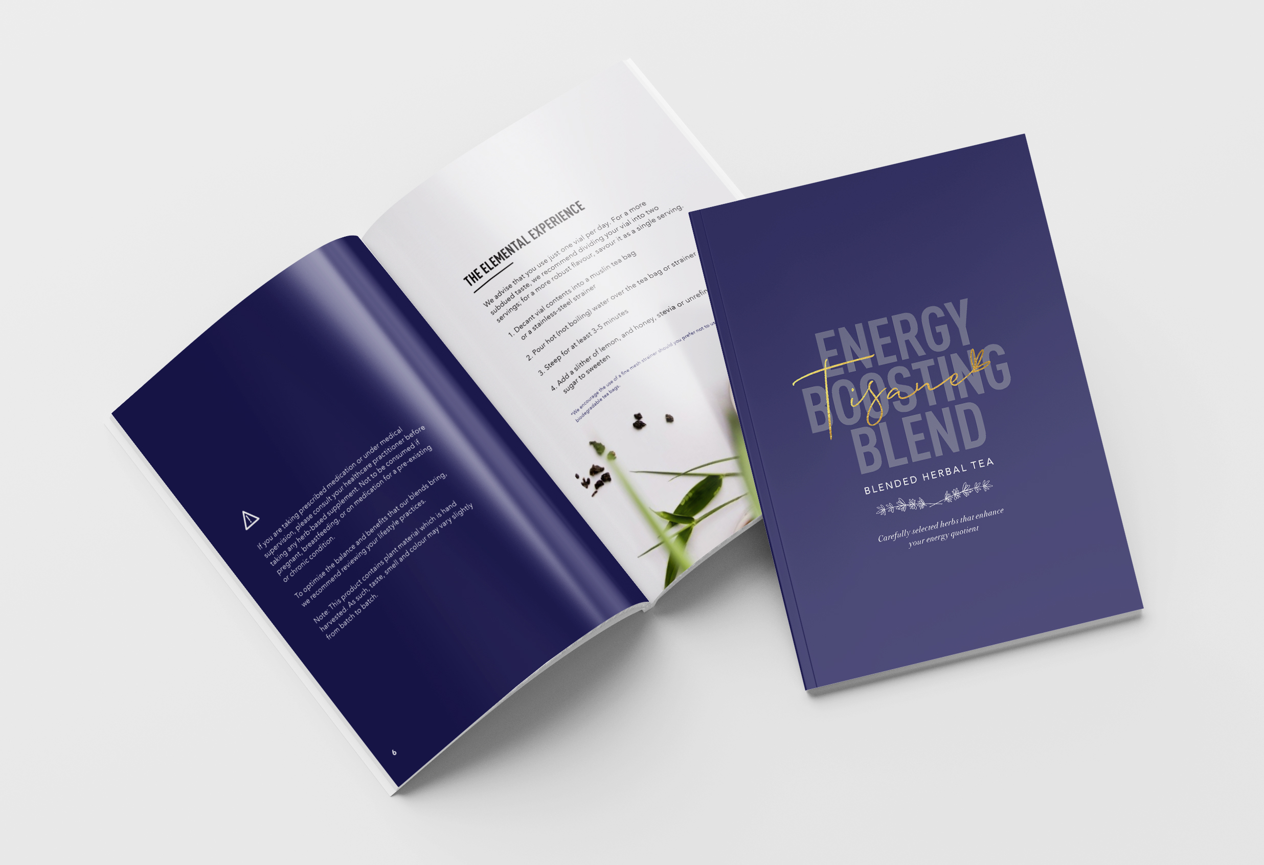
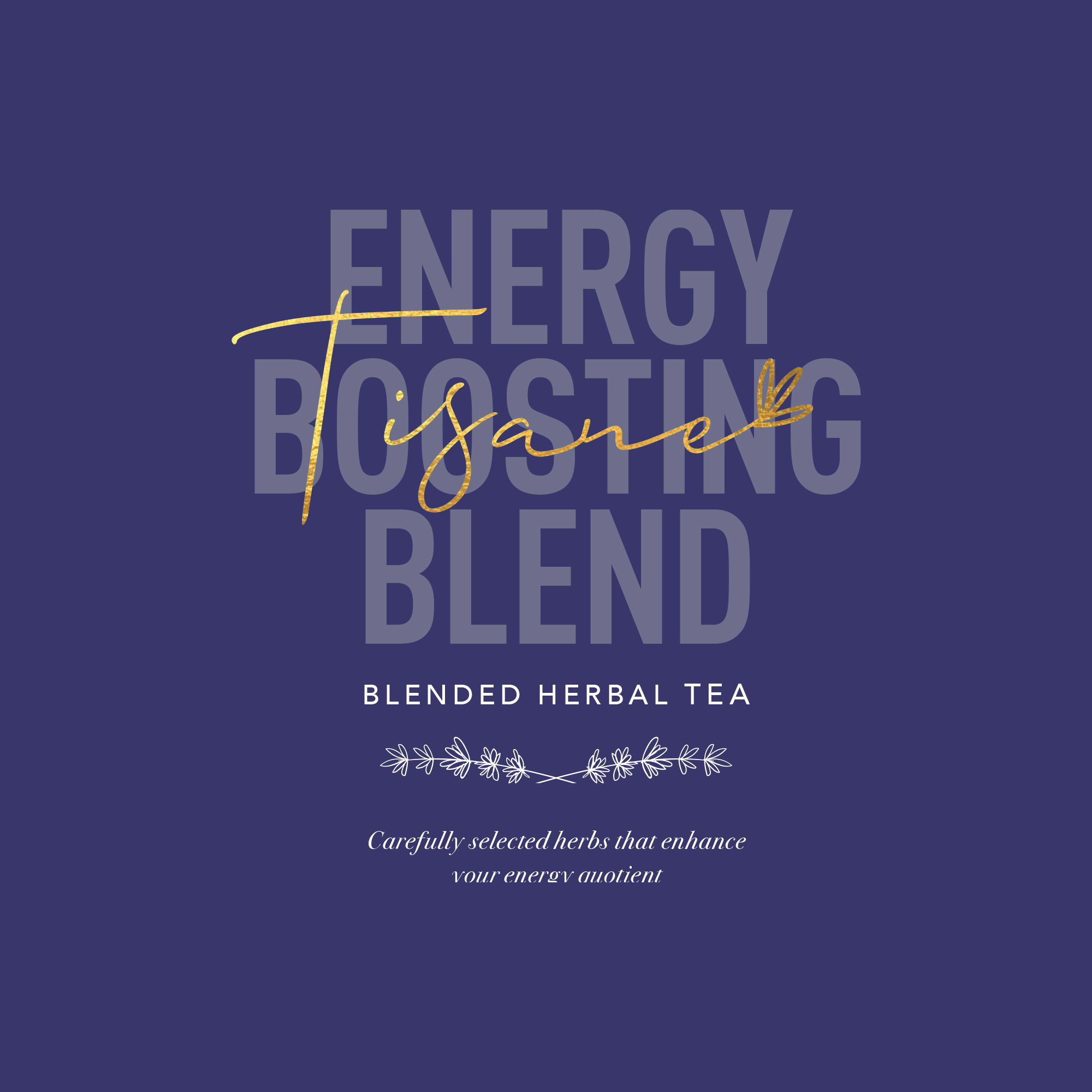
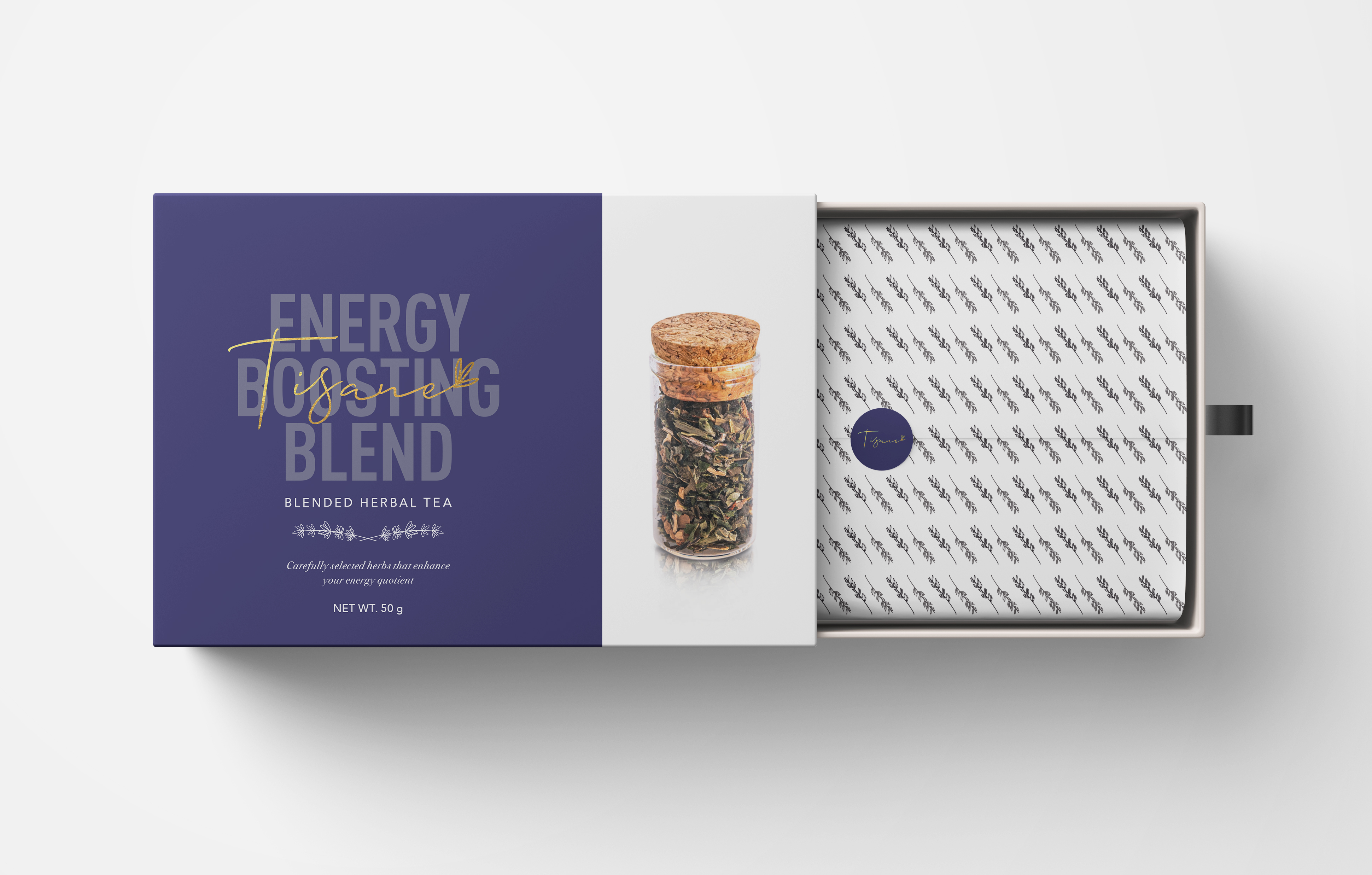
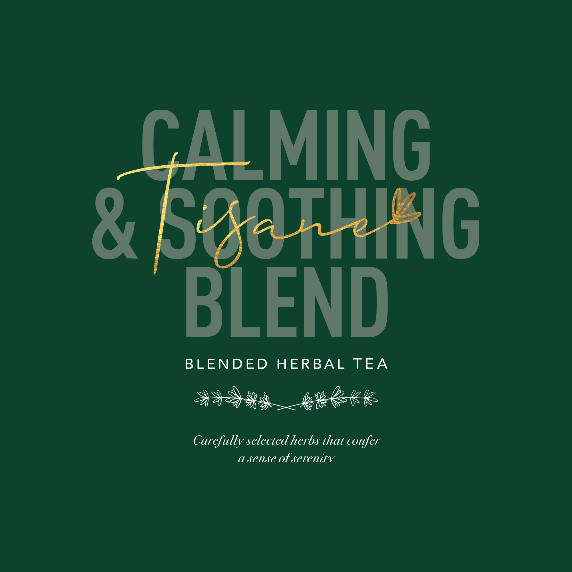
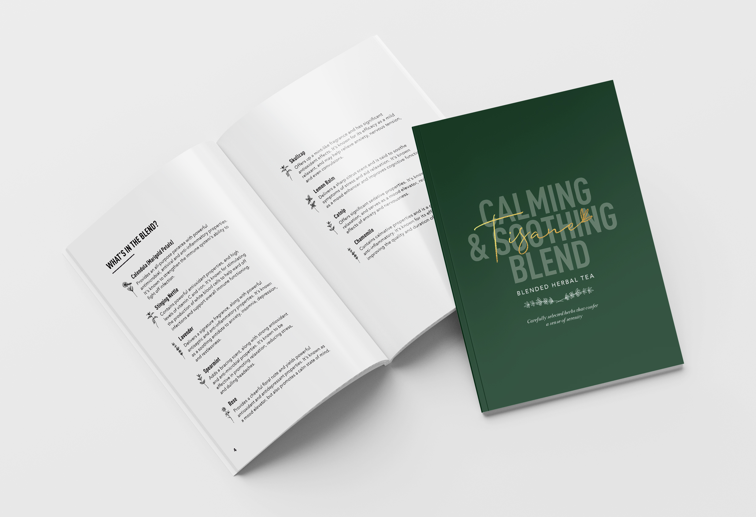
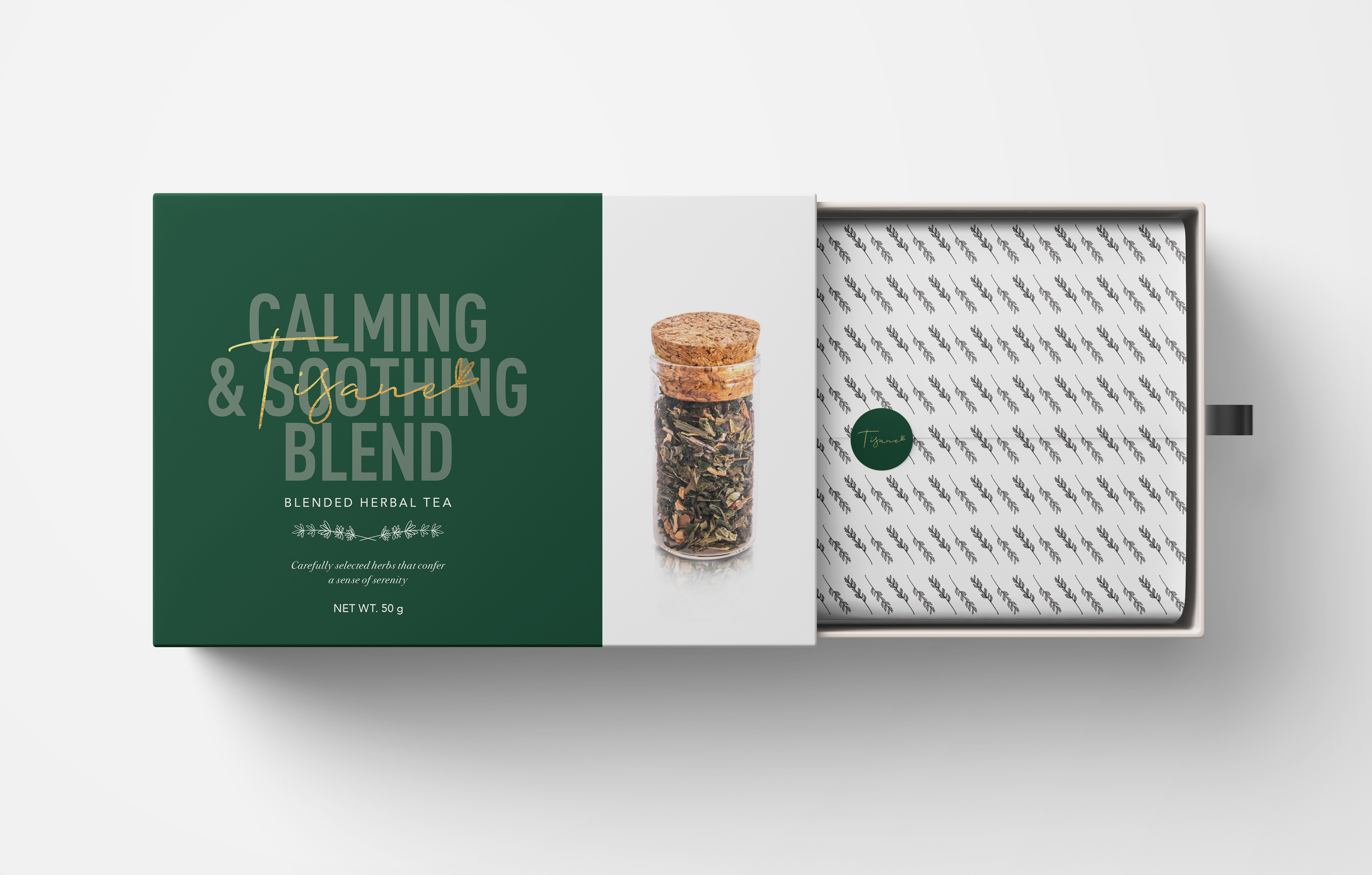
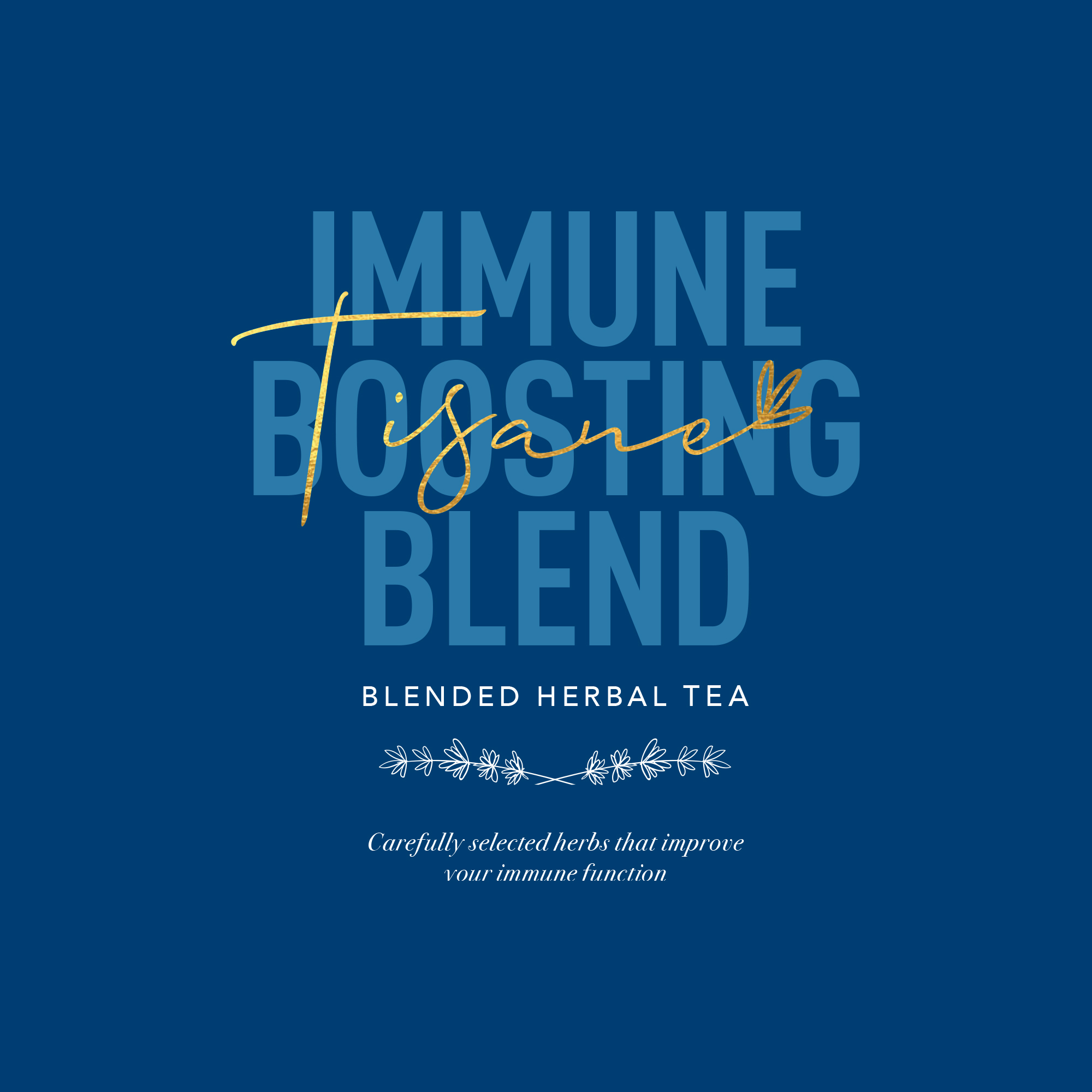
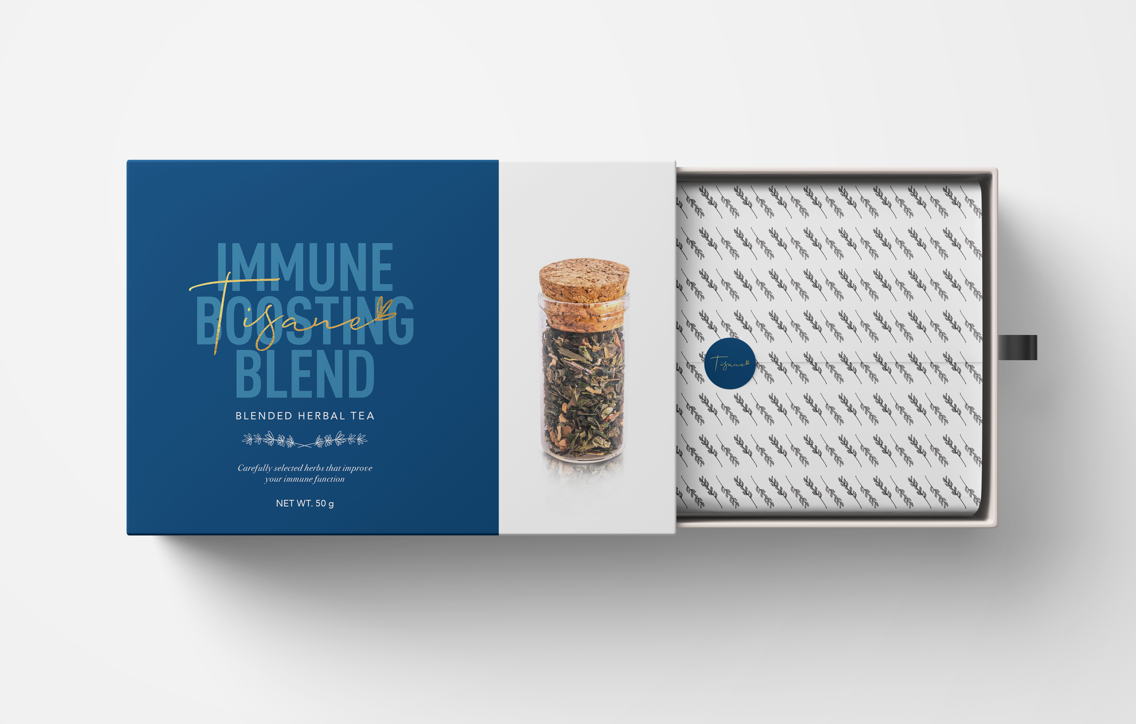
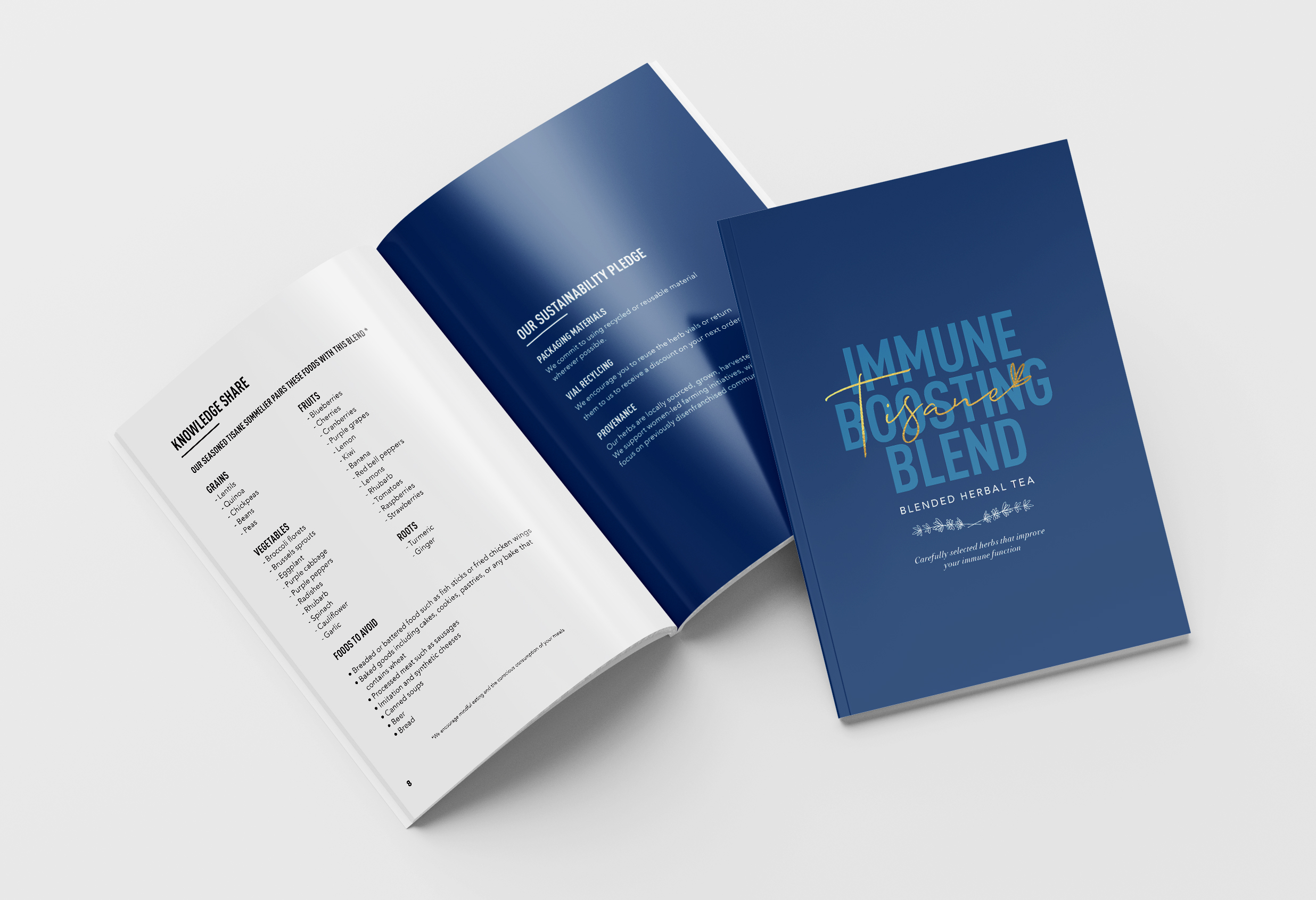
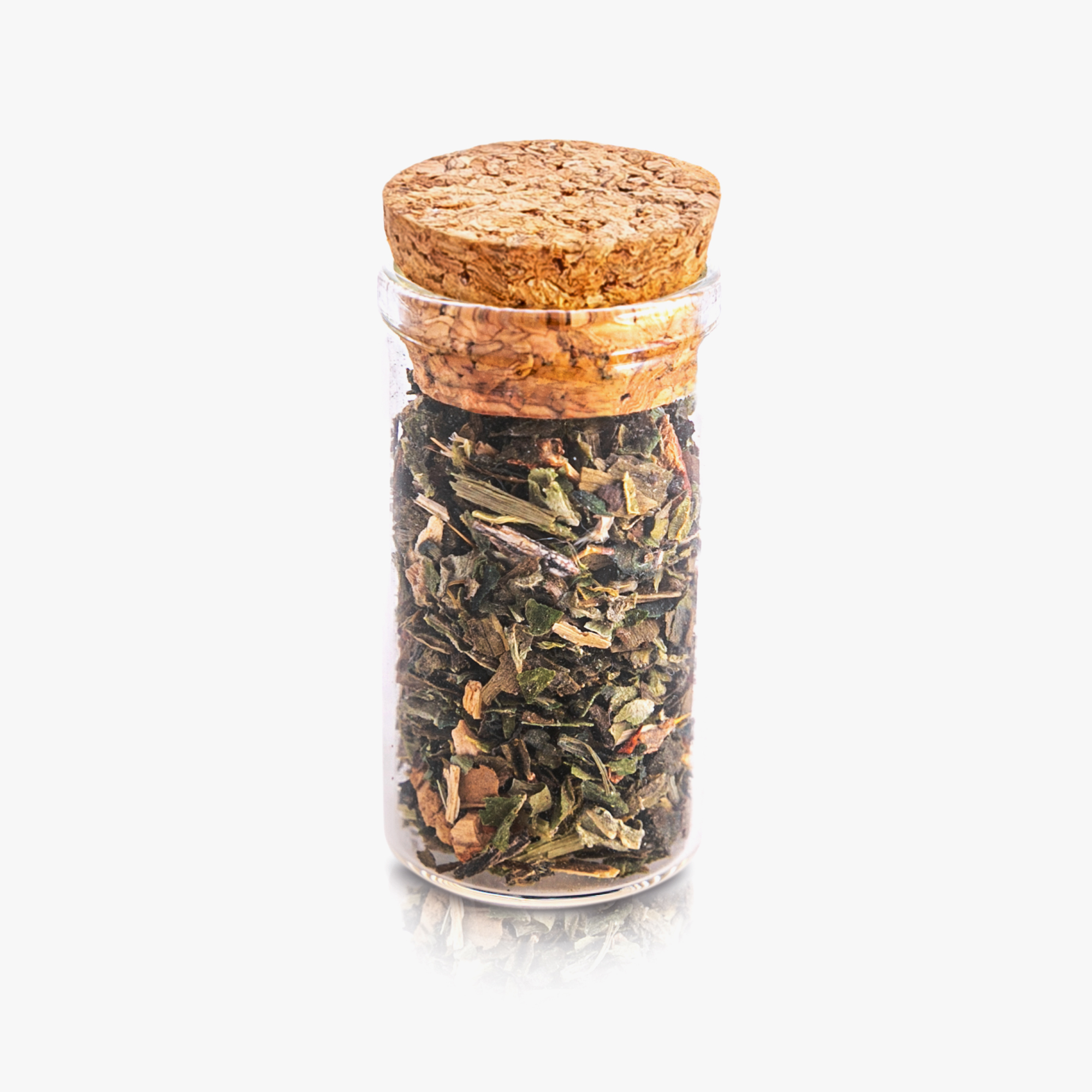
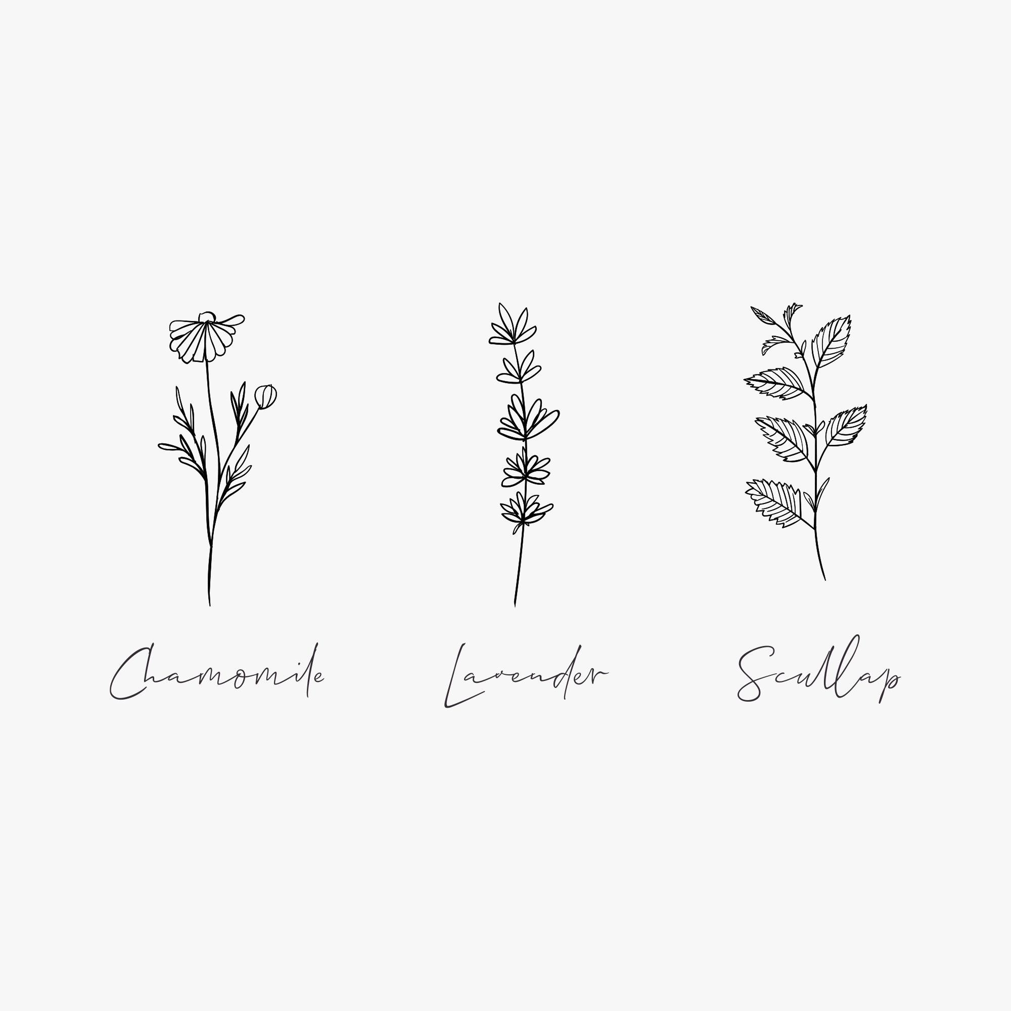
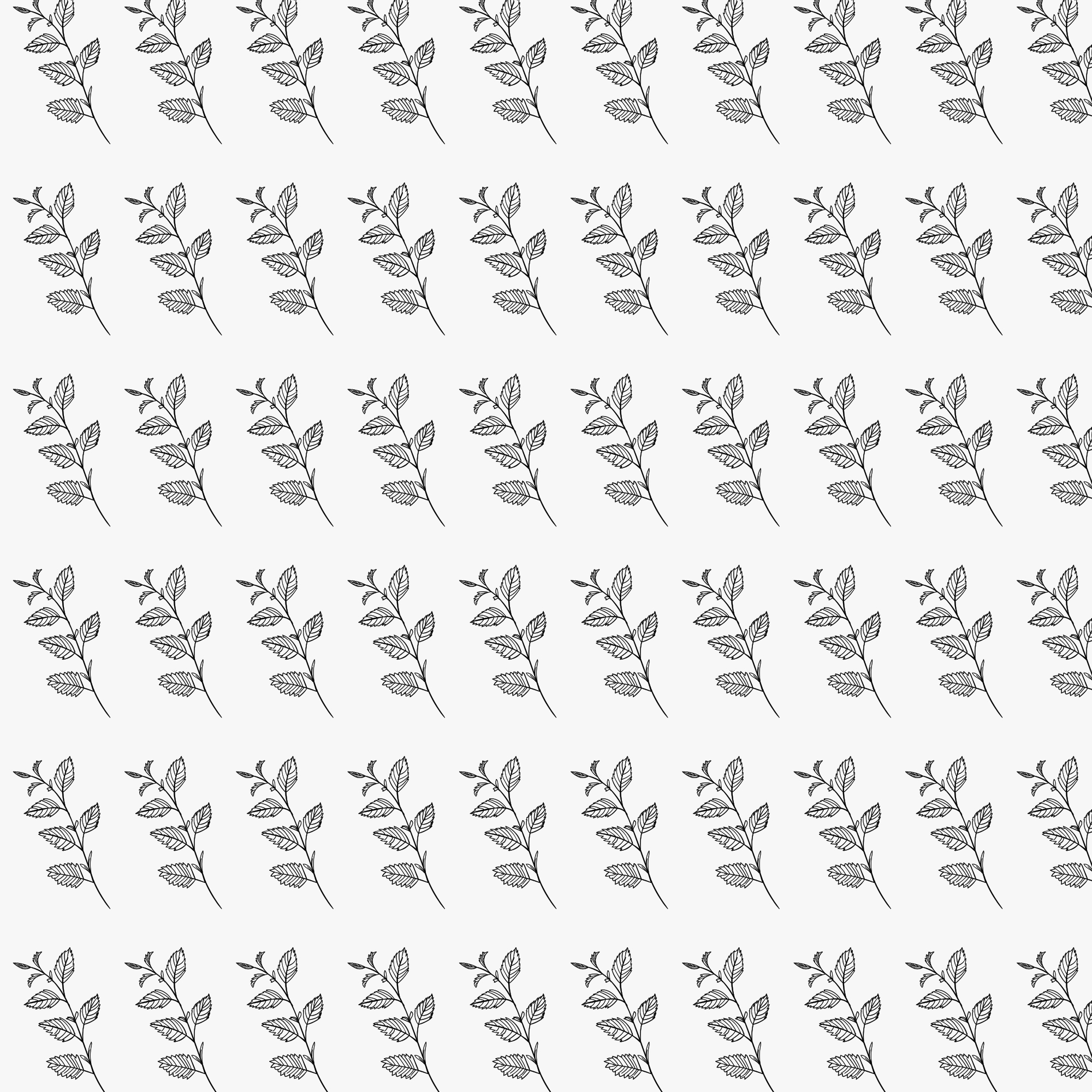
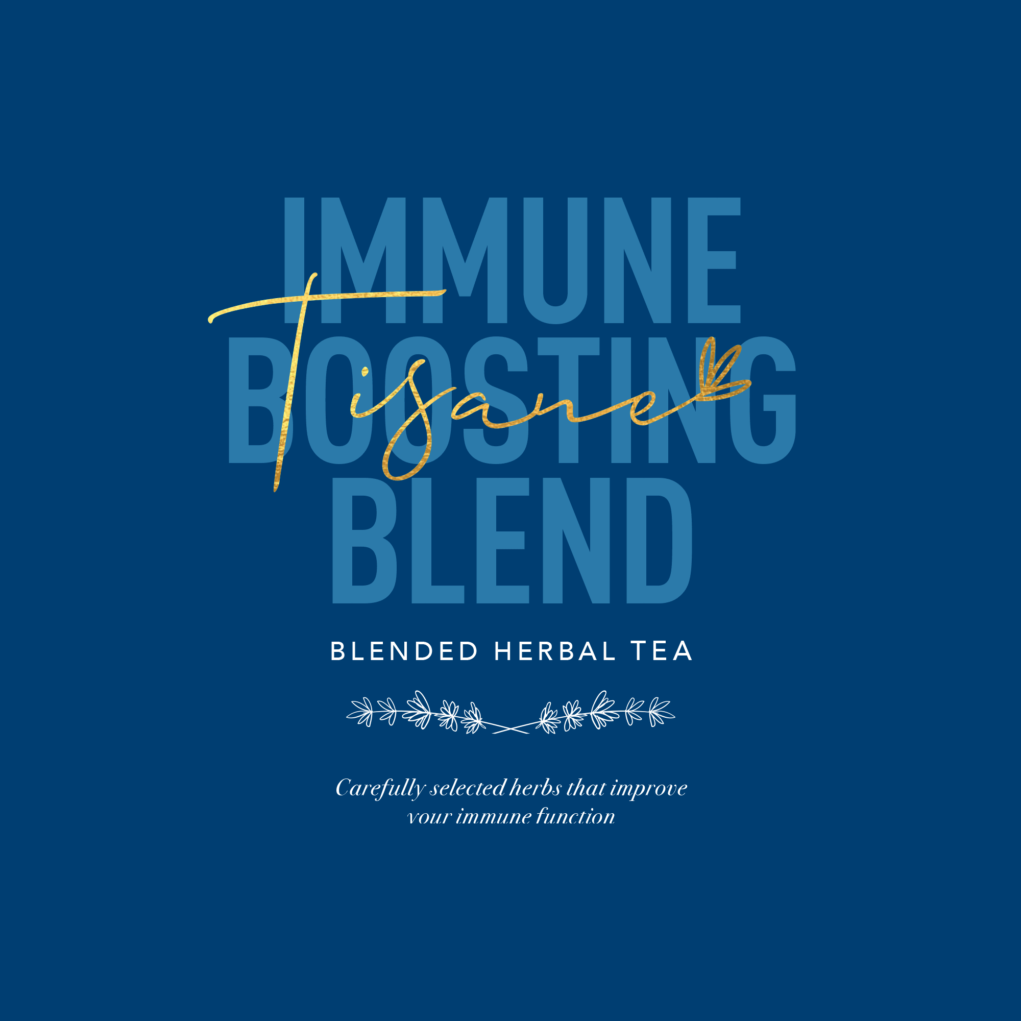
Tisane Herbal Tea Packaging Design
–
Designed for a new and emerging wellness brand, this project focused on creating a refined and calming packaging experience that reflects the therapeutic nature of the product. The brand identity and packaging were developed to position Tisane as a premium, nature-inspired herbal tea brand rooted in serenity and self-care. With its deep green tones, elegant typography, and subtle gold accents, the design evokes a sense of calm and sophistication—inviting customers into a ritual of relaxation. The use of clean layouts, glass jar visuals, and delicate botanical elements reinforces the quality of the blend and the care behind each product. As a new entrant to the market, this design sets the tone for the brand’s voice and helps build recognition in the growing wellness space.

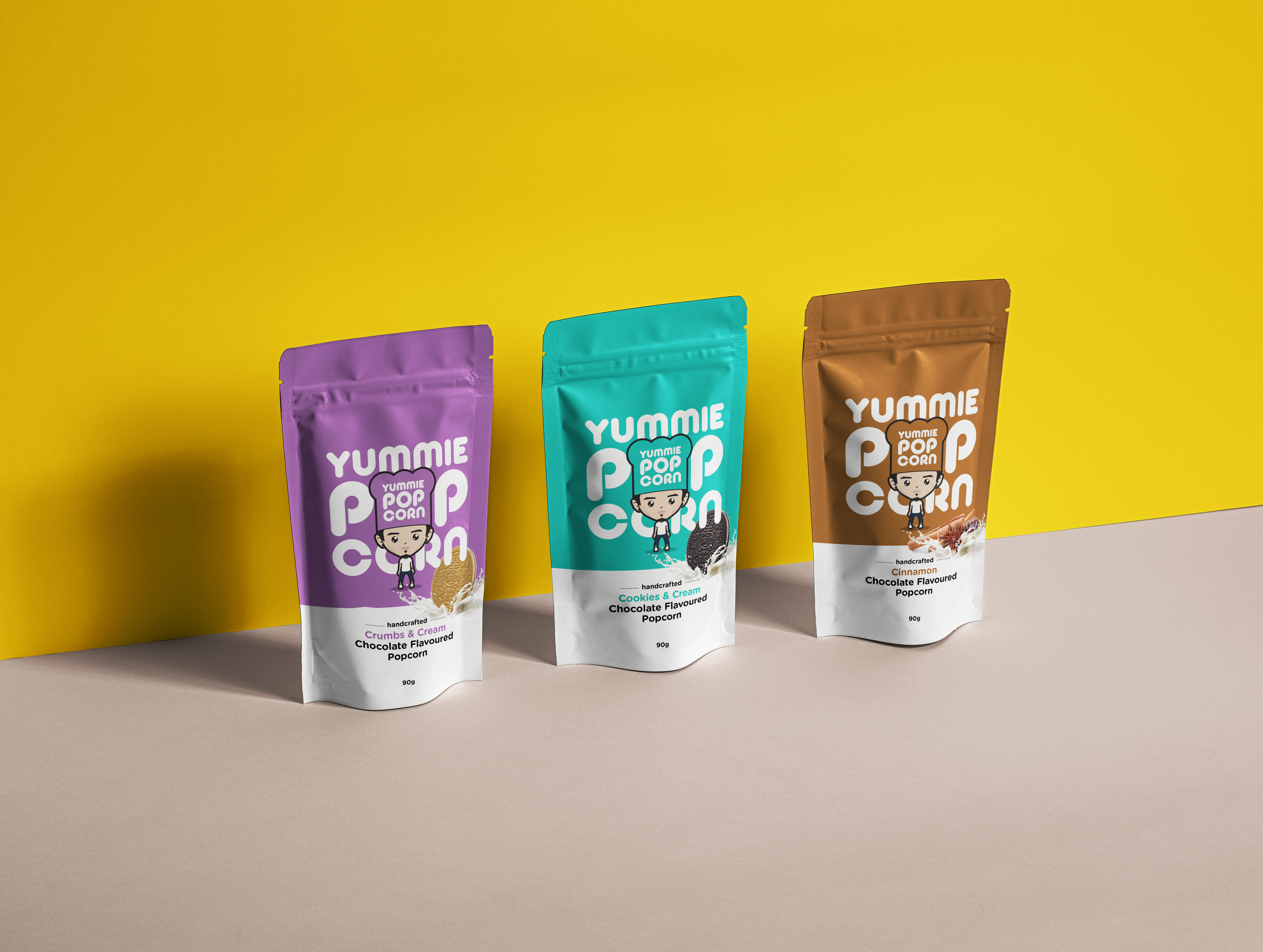
Yummie Popcorn Packaging Redesign
–
Created for a small business founded in 2017, this project involved the full development of the Yummie Popcorn brand identity and packaging range. The design direction was inspired by the brand’s playful spirit and handcrafted quality and brought to life through bold colour blocking, a custom illustrated character, and fun, flavour-coded packs that stand out on shelf. Each variant is visually distinctive, helping customers quickly identify their favourites while reinforcing the brand’s energetic, feel-good personality. The final packaging system strikes a balance between youthful charm and retail professionalism, appealing to a wide audience and designed to support both direct sales and reseller growth.
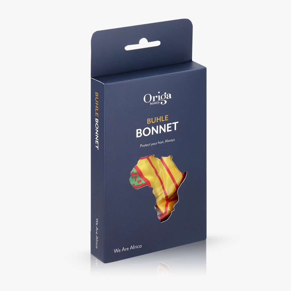
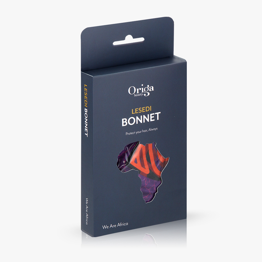
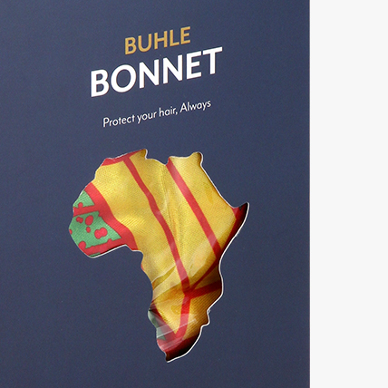
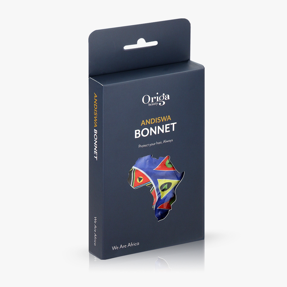
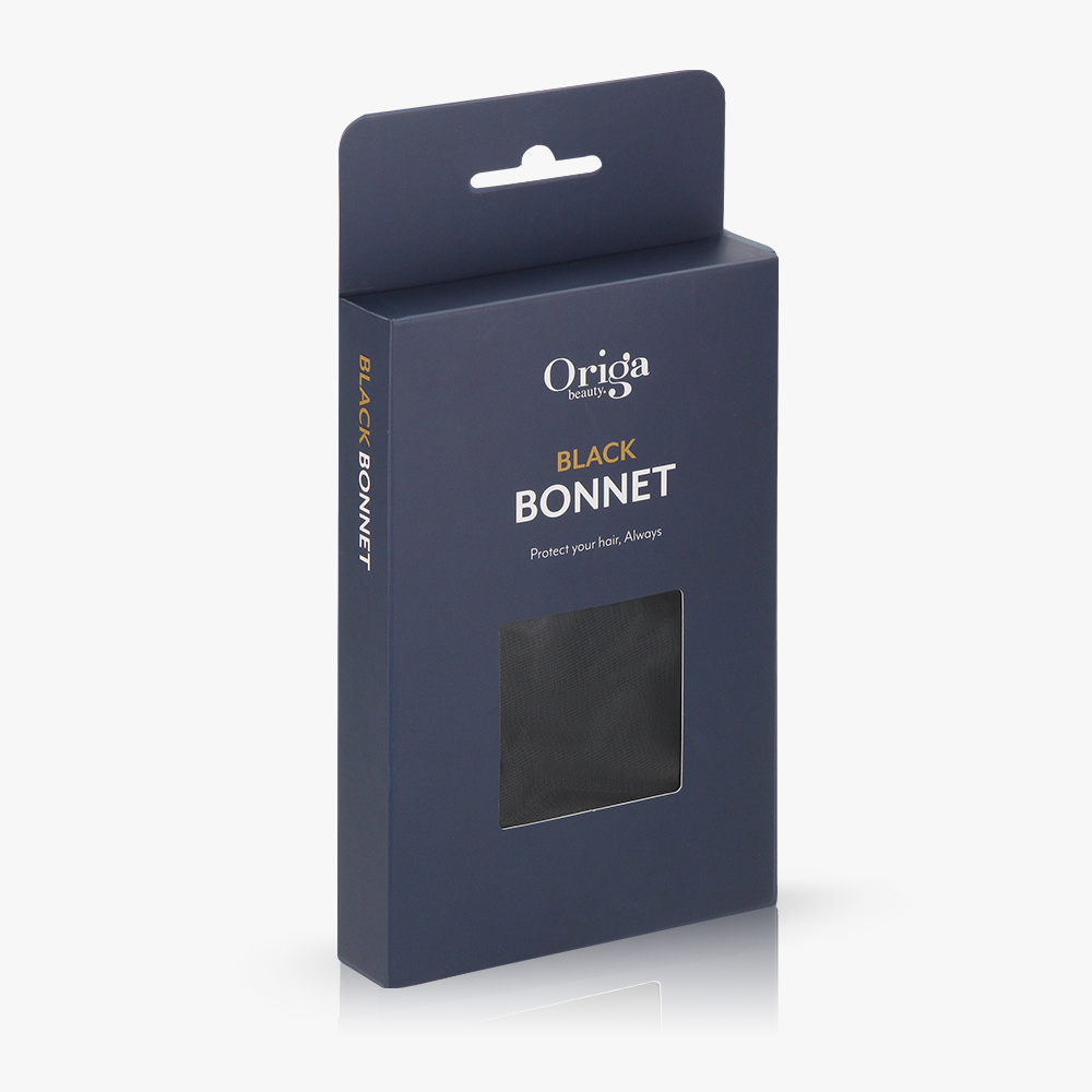
Origa Beauty Packaging Redesign
–
This project involved a full packaging redesign for Origa Beauty, a local premium beauty brand with the ambition to enter the retail space. The goal was to elevate the brand’s presence with a bold, refined look that would attract attention on shelf and drive sales. The redesign focused on creating a distinctive visual identity that reflects the brand’s quality, while ensuring clarity across its full product range. Following the successful relaunch, Origa Beauty secured its first major retail listing and is now proudly stocked in Clicks and marking a significant milestone for the business and its expansion into mainstream retail.

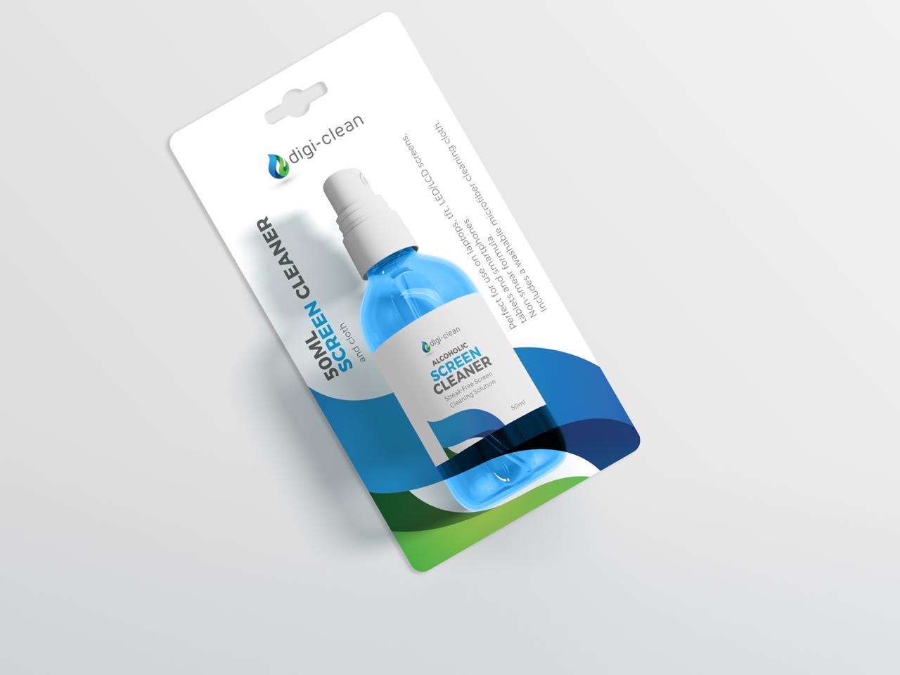
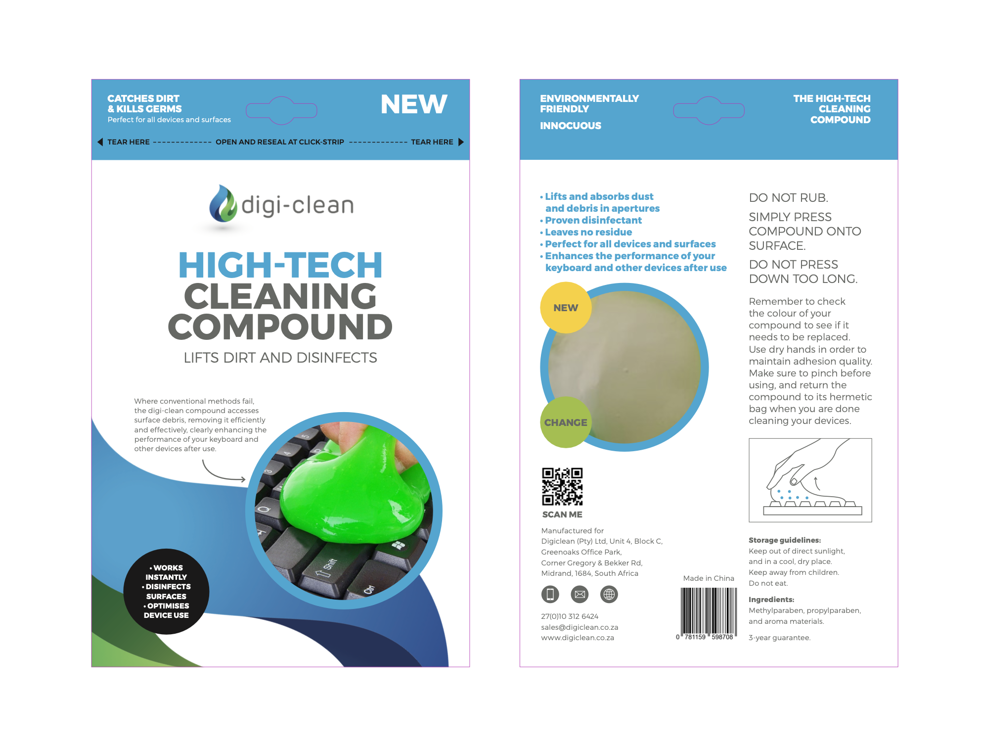
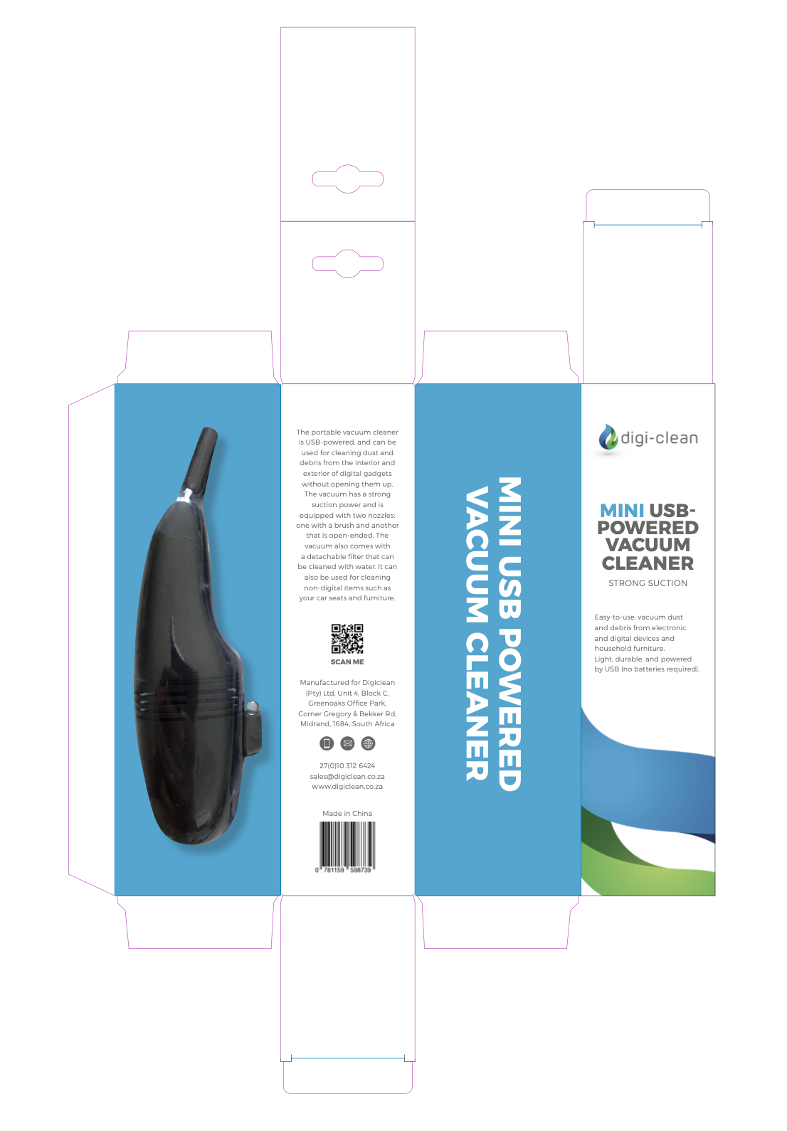
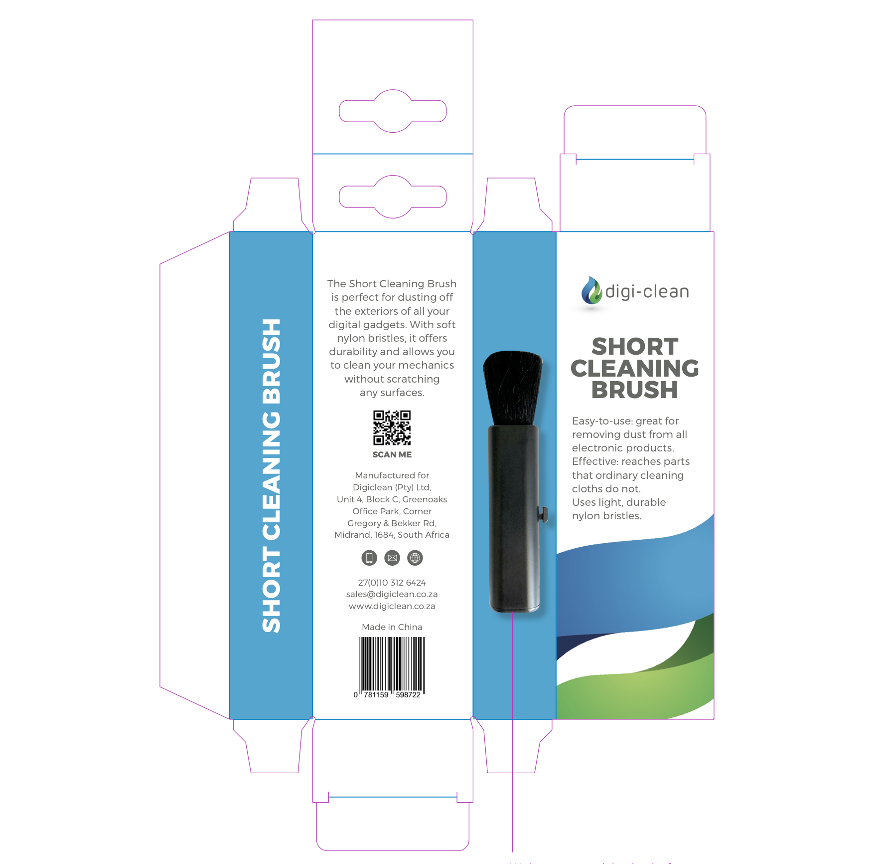
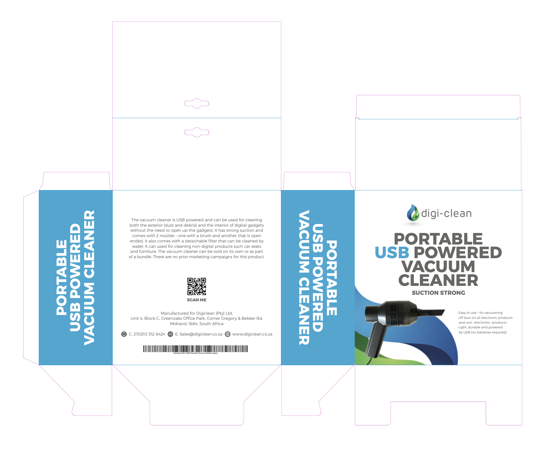
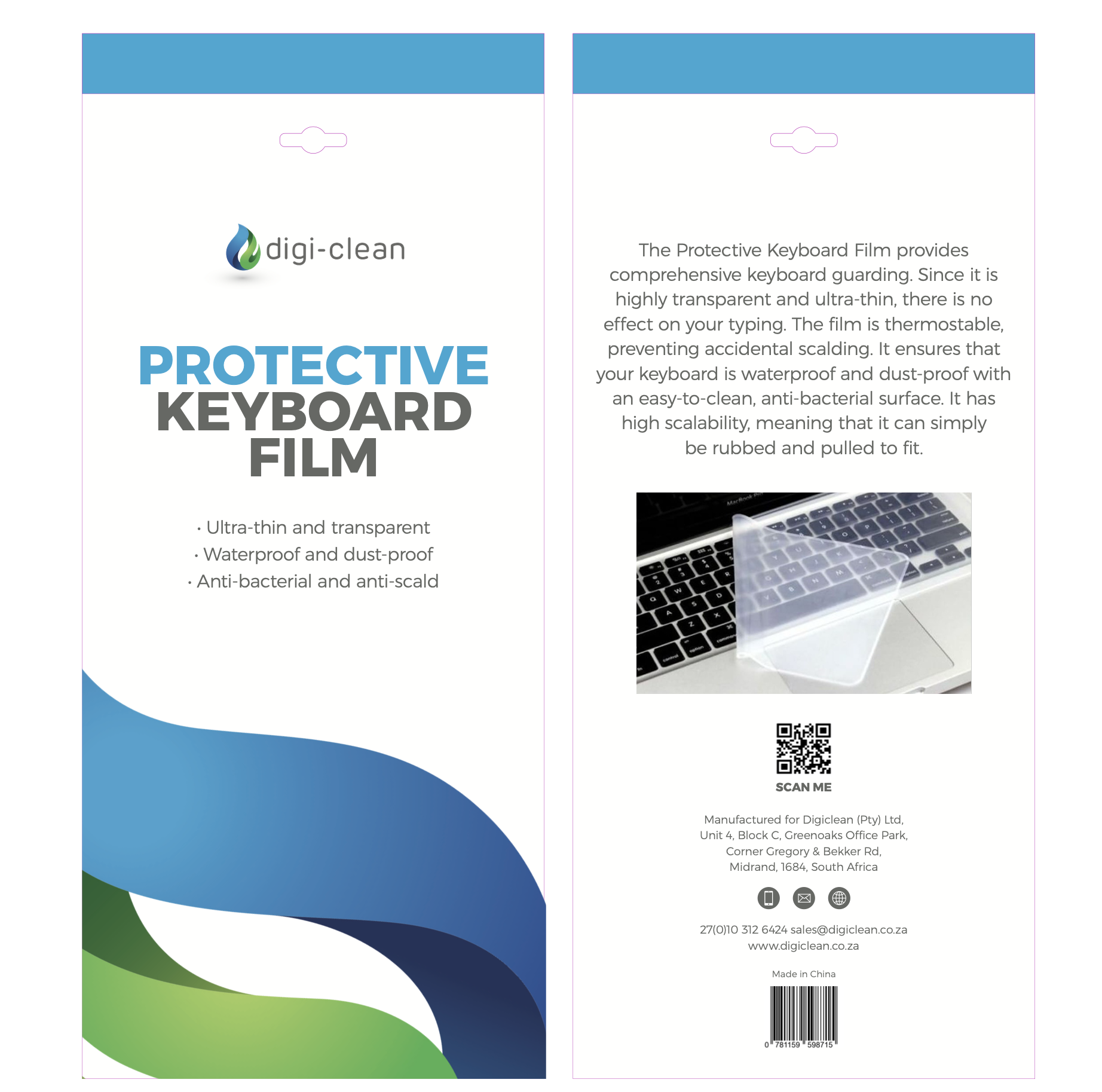
OrigaDigi-Clean Packaging Design System
–
This project was focused on creating a unified packaging system for Digi-Clean, a growing tech-cleaning brand. The brief required keeping the existing logo while establishing a clear and cohesive brand look and feel across a variety of products and pack formats. To create visual consistency, the existing logo was cleverly extended into a wave-like graphic device that flows across all packs—serving both as a recognisable brand element and a dynamic visual asset. A clean, minimal layout paired with fresh blue and green tones reinforces the brand’s association with hygiene, freshness, and ease of use. Typography and hierarchy were carefully structured for clarity, ensuring the packaging feels both informative and modern. The result is a scalable design system that enhances shelf presence while maintaining brand integrity.